For me, color is one of the most important things to master in abstract painting. And that’s something you’ll find confirmed in most painting courses. Contrary to some absurd preconceptions, abstract painting is not just a random use of color.
Beautiful color harmonies will make your paintings a success. A good place to start is by learning to use complementary colors.
First of all, let’s talk about the color wheel
Throughout history, researchers have tried to classify different colors. Today, the simplest and most effective way to do this is to use a color wheel or circle.
Arnold classic 2007 – fitness – final – bodybuilding home page: photo gallery of bodybuilding and fitness quality injectable steroids with shipping proscalpin finasteride buy online – sport bodybuilding.
What is the color wheel?
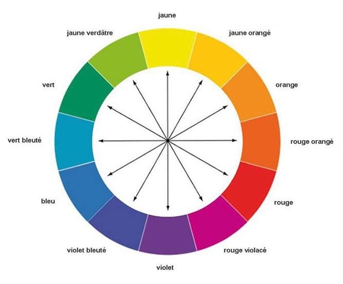
The color wheel classifies colors by hue. The different colors are arranged in a logical order: red, orange, yellow, green, ultramarine blue and violet.
Itten’s color wheel
This is the chromatic circle I use systematically. It makes it easy to create secondary and tertiary colors from primary colors. But that’s another subject.
I talk more about this in my article on color mixing.

The power of color harmonies
Sometimes I hear that abstract painting is easy, you just take any color you want and throw it on the canvas! This kind of remark shows how gullible some people are about contemporary art, and that’s a shame…
Abstract painting requires reflection. For me, color is one of the most important components.
It’s the thoughtful choice of colors that will make your abstract painting a success.
To sum up, a color harmony is a coherent set of colors that will work in all circumstances and in most contexts.
Complementary or opposite colors
Using complementary colors is a great way to create a beautiful color harmony, and what’s more, it’s a simple method to use and understand.
What are complementary colors?
The principle is very simple: complementary colors (also called opposite colors) are simply colors that are diametrically opposed on the color wheel.
Basically there are three main groups, in each group there is a primary color:
- Blue and orange,
- Red and green,
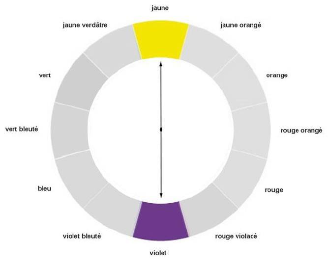
- Yellow and purple,
These groups can be combined with secondary and tertiary colors.
Opposite colors are far apart on the color wheel and therefore very different from each other. And yet, they work very well together.
Complementary colors are highly contrasting, and I recommend that you ensure that they are well saturated for the result to be effective.

Example of complementary colors
I like to use complementary colors in my abstract paintings. But let’s be honest: in the early days I used them without knowing it!
For example, I love using complementary colors: Yellow & Violet. I find that this palette lends itself perfectly to the abstract and modern art mood.

This color wheel illustrates the principle of complementary colors: yellow is diametrically opposed to violet.

Here’s the result of an abstract painting I did using the complementary colors Yellow and Violet. The contrast between the two shades is clearly visible.
Want to go further?
If you’d like to learn how to master colors and especially color harmonies, I recommend my digital course/book “Getting started with abstract painting”.
Pack offert : Techniques, matériel & guide
Pour vous lancer dans la peinture abstraite dans de bonnes conditions, je vous offre ce pack comprenant mon guide du matériel, un cours de peinture abstraite et une avalanche de conseils !

Continuer et télécharger


 Recevez votre Pack du peintre débutant